From Data to Story: Using Data to Advocate & Communicate
Data becomes most powerful when it helps tell a clear story about your library’s impact. This section explores how to turn data into compelling narratives, visuals, and comparisons that help communicate value to stakeholders and communities.
This section of the toolkit relies heavily on the Data Storytelling Toolkit for Libraries, a project of the Public Library Association & University of Illinois School of Information Sciences and supported by an IMLS planning grant.
Knowing your community and key library stakeholders will help you tell your library’s story more effectively. Different audiences care about different outcomes. For example, board members may want to understand financial and community impacts, while community members may care more about how services and collections benefit families, students, or job seekers.
The Data Storytelling Toolkit for Libraries includes a module that helps librarians identify their audience and tailor their message accordingly.
Recommended Resource:
Audience Tutorial from the Data Storytelling Toolkit for Libraries
Tip: Tailor Your Message
Different audiences care about different things.
– Board members – outcomes, strategy, accountability
– Funders and government officials – impact, return on investment
– Community members – services and benefits
– Media – compelling stories and trends
Framing data with the audience in mind makes it much more persuasive.
Building a clear narrative is important in data storytelling because it helps audiences understand not just the numbers but also the meaning and impact behind them.
Library Stories Amplify the Data
Numbers are more persuasive when paired with real-life examples. In public libraries, metrics like program attendance, circulation, or digital resource usage tell one part of the story. Pairing them with patron stories, staff experiences, or community outcomes brings the data to life.
Tips for Combining Data and Stories
– Start with your audience: What do they care about? What questions are they likely asking?
– Use one story at a time: Even a short anecdote can make numbers relatable.
– Keep it concise: Data shows the scope, stories show the impact. Together, they make your message memorable.
– Visualize thoughtfully: Charts, graphs, and infographics can highlight trends, while stories provide context and emotion.
By combining metrics with narrative, library staff can demonstrate not only what is happening, but why it matters, making data more actionable, relatable, and compelling for stakeholders and communities.
Recommended Resource:
Narrative Structure Tutorial from the Data Storytelling Toolkit for Libraries explains common story structures (like transformation, continuity, and discovery) and introduces a step-by-step method (S-DIKW) to help turn raw data into a meaningful, audience-focused story.
Visual storytelling techniques help librarians turn data into clear, compelling visuals that make patterns, comparisons, and changes over time easy to understand at a glance. By thoughtfully using charts, maps, infographics, before-and-after visuals, and comparative context, you can highlight what matters most and guide your audience to the key insights in your data.
For example, a line chart can clearly show growth in program attendance over several years, while a simple infographic might summarize how many residents use library services each month.
Recommended Resources:
The Design Lab at UW Madison – This resource page from DesignLab provides an overview of infographics and data visualization concepts and design principles, along with recommended software tools, practical tips for creating effective visuals, and illustrated examples. It’s intended to help users learn how to tell stories with data and design clear, engaging visual communication.
For example of compelling visualizations, check out this print title:
Knaflic, Cole Nussbaumer. Storytelling with Data: A Data Visualization Guide for Business Professionals. Wiley, 2015. https://www.storytellingwithdata.com/
This RIPL webinar introduces core principles of effective data visualization and design, guiding participants through best practices for choosing charts, using color, and crafting visuals that clearly communicate information based on audience needs. It also offers hands‑on activities and resources to help library staff build confidence in creating accessible, impactful visual representations of data.
Many data visualization tools are available to help turn raw data into clear charts, graphs, maps, and dashboards. Common options range from spreadsheets tools, such as Excel or Google Sheets, to more advanced platforms like Tableau, Power BI, and Looker Studio that allow users to build interactive dashboards and reports. (See Public Library Dashboards & Visualization Tools).
This simple guide from UC Berkeley Library explains what different charts are best for and which question each chart helps answer. It covers bar charts, line charts, pie charts, scatter plots, and more.
Tip: Choosing the Right Chart
Many people remember chart types using three basic questions:
– Comparison: Bar chart
– Trend over time: Line chart
– Parts of a whole: Pie chart
There are also specialized tools for creating infographics and visual reports, such as Canva or Infogram. These tools make it easier to organize data, highlight trends, and communicate insights to stakeholders in a visual and accessible way.
Recommended Resources:
Canva – https://www.canva.com/graphs/data-visualization/ (free version available)
Infogram – https://infogram.com/ (free version available)
Benchmarking helps you understand how your library performs relative to similar libraries or national standards. By comparing key metrics — like program attendance, circulation, digital resource use, or budget per capita — you can identify strengths, areas for improvement, and opportunities to advocate for resources.
The WPLC Data Dashboard Training Manual contains some helpful advice on how to benchmark your library’s data. The Dashboard has a tool to compare your library against other selected libraries or a cohort average to…
When benchmarking, it’s important to compare libraries that are similar in size, population served, locale code, or funding levels. However, don’t always compare yourself to the same cohort or library. Your specific research question might influence what libraries you should consider for comparison.
Recommended Resource:
This RIPL webinar introduces practical methods for using Public Libraries Survey (PLS) data and related tools to compare your library with peer institutions and better understand community needs. It provides hands-on guidance for accessing, analyzing, and applying library data to support planning, evaluation, and more informed decision-making.
Using data for strategic planning, decision-making, and advocacy is essential in public libraries because it provides clear evidence about community needs, library usage, and program impact. By analyzing data such as circulation statistics, program attendance, demographic information, and user feedback, library leaders can make informed decisions about services, staffing, collections, and resource allocation. Data also helps libraries identify trends, measure outcomes, and adjust strategies to better serve their communities. In addition, strong data supports advocacy efforts by demonstrating the library’s value and impact to stakeholders, funders, and local government officials, helping secure the support and resources needed to sustain and grow library services.
The WPLC Data Dashboard Training Manual helps outline how you might use certain data in your library storytelling. See page 5.
Why Storytelling? See this article by Dr. Kate McDowell – Storytelling wisdom: Story, information, and DIKW, March 2021, https://doi.org/10.1002/asi.24466
Data Storytelling Examples
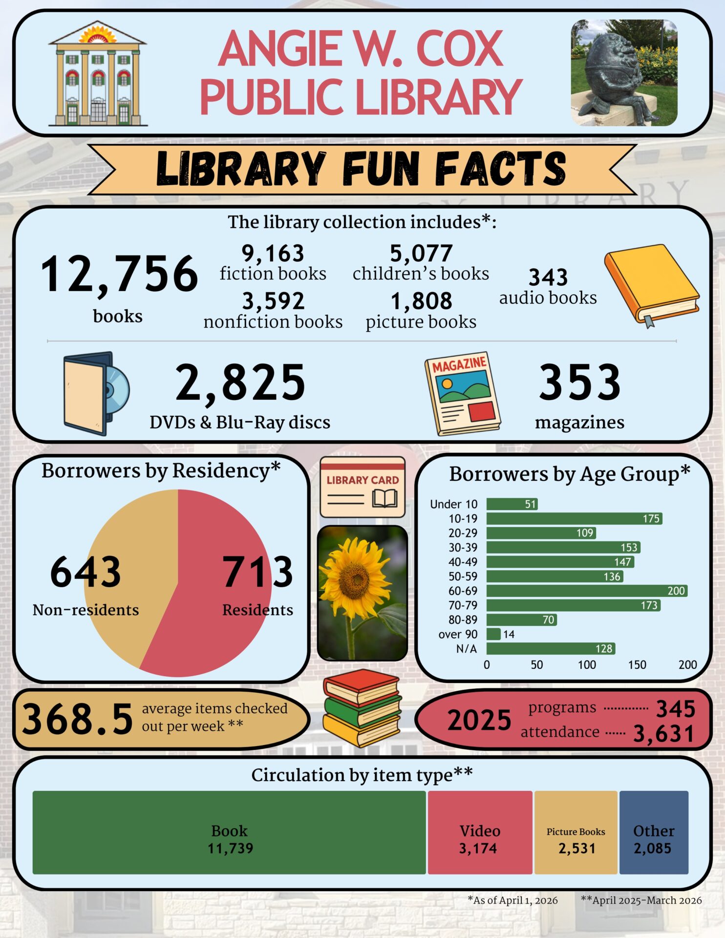
Angie W. Cox Public Library
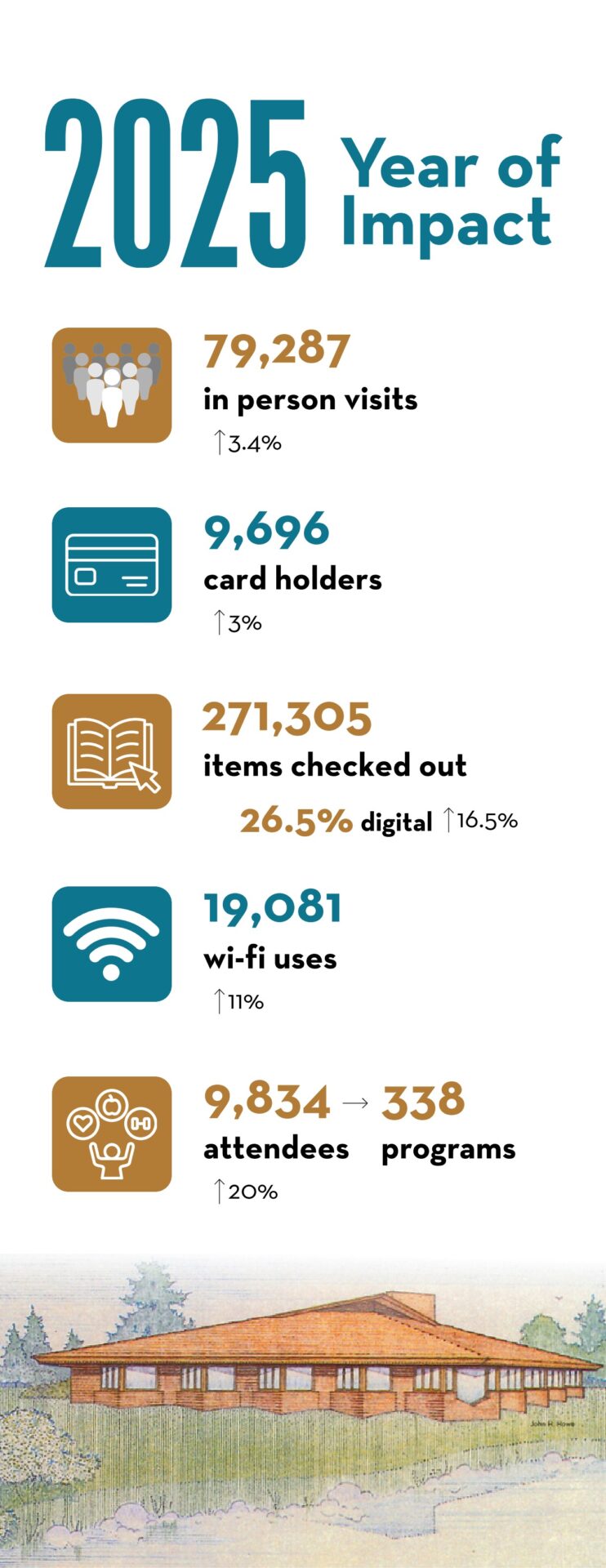
Menomonie Public Library Page 1
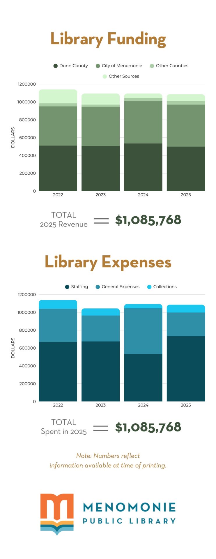
Menomonie Public Library Page 2
Tip: Focus on Impact
When using data for advocacy, highlight:
– how many people are served
– how services meet community needs
– how library programs improve outcomes
Impact-focused data helps decision-makers understand the library’s value.